I'm Si Hammond, a data developer who creates interactive data experiences for the web. I build visualizations, searchable databases, and applications that help people explore and understand complex information.
Need to transform your data into an engaging user experience? Let's discuss your project: si@shellsi.com
 OnVocation Project
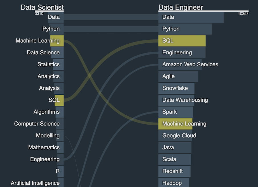
An in-house project built on insights gained from client work, featuring a continuously updated database of over 1.5 million tech-specific job posts, sourced through daily crawls of top job sites. This rich dataset is mined to create a proprietary knowledge base of job titles and skills, modeled for statistical associations and presented through engaging visualizations. View it here

 Recruiting Brainfood Community
Recruiting Brainfood is a leading newsletter in the talent industry with more than 36,000 subscribers after hundreds of weekly editions.
By automatically scraping and parsing the newsletter, we could graphically credit the various types of contributions from the RBF Community — as well as producing a searchable database of content.
By supporting login with LinkedIn, we could let Brainfooders claim their profiles and add extra data, creating a pop-up directory of active members. Skills Heat
The landscape of tech job skills is shifting at a dizzying rate. This tool uses data from the Dice job site to show which skills are heating up from demand outstripping supply - and which are going the other way.
Si came up with a brilliant succinct clean way of visualizing that dynamics while tackling the challenge of way too many skills cluttering the screen.
full testimonialWe at the Data Science team had the need to represent tech skill supply vs demand to provide a glimpse into which skills are hot, which have fallen out of popularity, on some sort of relative scale. Si came up with a brilliant succinct clean way of visualizing that dynamics while tackling the challenge of way too many skills cluttering the screen. One can clearly see the entire landscape and zoom in on particular skills or groups of skills. In addition, trend information is readily available in the form of line charts. This visualization shows how a big volume of data points can be exposed in an elegant comprehensible way on one single page.
 6 Months On
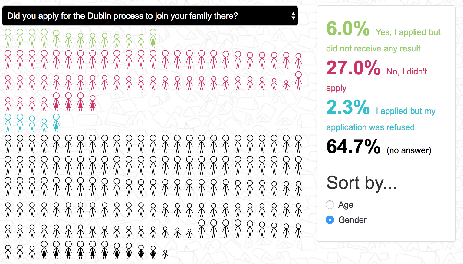
Pie charts are familiar means of conveying information but for the refugee survey by the RRDP (now RRE) I wanted to accentuate the human aspect. Show attributes like gender, age and nationality with stick figures – regrouping in response to survey questions – I was able to show more information and increase impact. View it
It was really delightful to work with Simon as he was highly professional, respectful and really responsive to our feedback throughout the process...
The final product was fantastic...
full testimonialSimon kindly helped Refugee Rights Europe in 2017 with a visualisation of our field research data relating to refugee children in Europe, on a pro bono basis. It was really delightful to work with Simon as he was highly professional, respectful and really responsive to our feedback throughout the process. Even though this was a pro bono project, he worked in a timely manner and ensured effective communication with our team. The final product was fantastic, and it really helped us tell the story of some terrible predicaments which refugee children in Europe face, so that we could better communicate our message and influence policy and practice for the better.
 Data Analytics Ecosystem
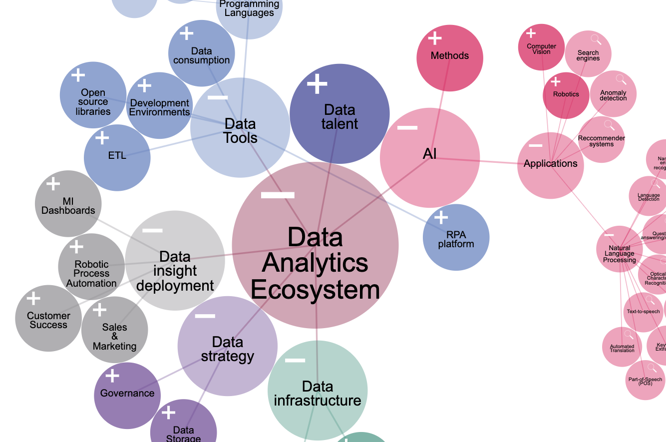
The Data Analytics & Insight unit at Hg strives to empower its portfolio of companies with the latest tools. Whilst the vast array of options can be dazzling, this expandable view makes exploration of the ecosystem intuitive and appealing.
Privacy Policy